Introduction
For this assignment, we had to create a cereal box and created everything on our own. The first step was doing some research to get inspired and figuring out what topic and name everyone wants to do. Then you needed to take your sketches and make them on illustrator and if needed, using photoshop to assist. After you created it and got critiques, it was time to make the final version. After I made the final version, and using the critiques I got so the box could be the best it can be. Next, after it is printed you have to spray mount it and cut it out and put everything together. This project is bringing everything learned in the graphic design career and using it to produce this project.
Research
1. List 3 possible themes your cereal could have, Boldface your best choice and continue to step#3.: You will need to think of a theme for your cereal. The theme should be clear and specific. Be careful to choose a theme that has plenty of imagery associated with it.
Some possible themes: Las Vegas, winter, zombies, jogging, roller derby, logging/forestry, old people, Egypt, pirates, the farm, volleyball, etc.
Some possible words to use in the cereal name: crunch, crunchies, pops, flakes, clusters, puffs, bits, bites, munchies, O’s, pellets, toasties, bunches, bran, squares, nuggets, grains, pebbles, cubes, morsels, pieces, chunks, minis, dunks, oats, spheres, loops, krispies, etc.
Examples for “old west” theme: howdy, buckaroo, high noon, git outta town by sundown, good bad & ugly, OK corral, six-shooter, rough rider, wrangler, posse, chuck wagon, dude ranch.
Examples for “old west” theme: cowboy hat, rope, lasso, cactus, pistol & holster, horseshoe, corral, saloon, sheriff's badge, vest & chaps, spurs, longhorn bull, wanted poster, hangman’s tree, hitching post, Billy the Kid, Tombstone, wagon, Indians, rifle, high noon, those hinged doors in the saloon, campfire, etc.
Examples of items the design SHOULD include... a logo, name, barcode, nutrition information, color bar, game, character or photo, background color, Images?, something to read while eating?
Some possible themes: Las Vegas, winter, zombies, jogging, roller derby, logging/forestry, old people, Egypt, pirates, the farm, volleyball, etc.
- Sports
- Summer
- Shopping
Some possible words to use in the cereal name: crunch, crunchies, pops, flakes, clusters, puffs, bits, bites, munchies, O’s, pellets, toasties, bunches, bran, squares, nuggets, grains, pebbles, cubes, morsels, pieces, chunks, minis, dunks, oats, spheres, loops, krispies, etc.
- Flakes
- O’s
- Puffs
- Krispies
Examples for “old west” theme: howdy, buckaroo, high noon, git outta town by sundown, good bad & ugly, OK corral, six-shooter, rough rider, wrangler, posse, chuck wagon, dude ranch.
- Score
- Shoot
- Great
- Great shot
- Take the shot
- Time
- Races
- Winning
- Losing
- Fitness
- Athletes
- Game
- Stamina
- Participation
- Fast
- Slow
- Development
- Training
- Physical
- Mental game
Examples for “old west” theme: cowboy hat, rope, lasso, cactus, pistol & holster, horseshoe, corral, saloon, sheriff's badge, vest & chaps, spurs, longhorn bull, wanted poster, hangman’s tree, hitching post, Billy the Kid, Tombstone, wagon, Indians, rifle, high noon, those hinged doors in the saloon, campfire, etc.
- Field Hockey
- Soccor
- Cross Country
- Swimming
- Wrestling
- Fencing
- Basketball
- Softball
- Lacrosse
- Track & Field
- Volleyball
- Rowing
- Football
- Ice Hockey
- Golf
- Boxing
- Gymnastics
- Rugby
- Skiing
- Archery
- Martial Arts
- Ice Skating
- Diving
- Water Polo
- Netball
- Equipment
- Equestrianism
- Baseball
- Tennis
- Badminton
- Polo
- Triathlon
- Marathon
- Hiking
- Running
- Cricket
- Handball
- Surfing
- Netball
- Judo
Examples of items the design SHOULD include... a logo, name, barcode, nutrition information, color bar, game, character or photo, background color, Images?, something to read while eating?
- A logo
- Name
- Barcode
- Nutrition Facts
- Word search game
- Photo/Character
- Background color
- Information about sports around the world
- What it includes?
- Coupon on the front
- “Free inside” - some sort of figure or paper included in the box
- Describe the cereal on the side
- Some sporty encouraging words
- Different games on the back
- “Scan this code for…”
- “Distributed by…”
- On the front have a character with the bow of cereal or something like that
- Weight of box
- How much is inside (oz,pounds)
- A joke somewhere on it
|
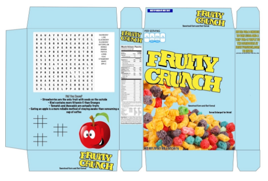
Early VersionsTo the left is my first version of my cereal box. I switched my information and title from my research because I felt better about doing this. I was struggling to find what I should put on the back. I wanted to use a word search because when I did my research I found a lot of them have word searches on the back. Also I decided to put the logo on the top/bottom and side because of what I saw on other cereal boxes. Additionally, I added the top because the captain crunch boxes they have the 'per serving' thing at the top. Originally, I was going to have a bowl and then have cereal in it. But then I changed it because it looked too pixilated when I made it. Some critiques I got from classmates were:
|
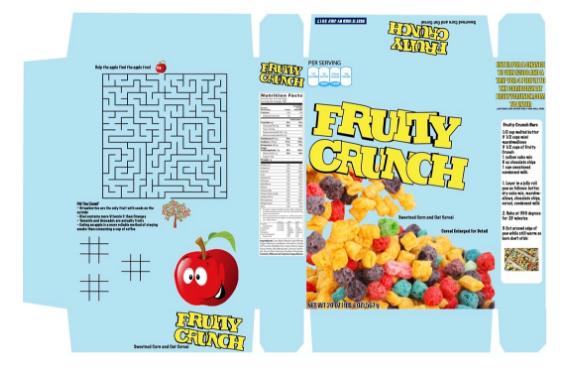
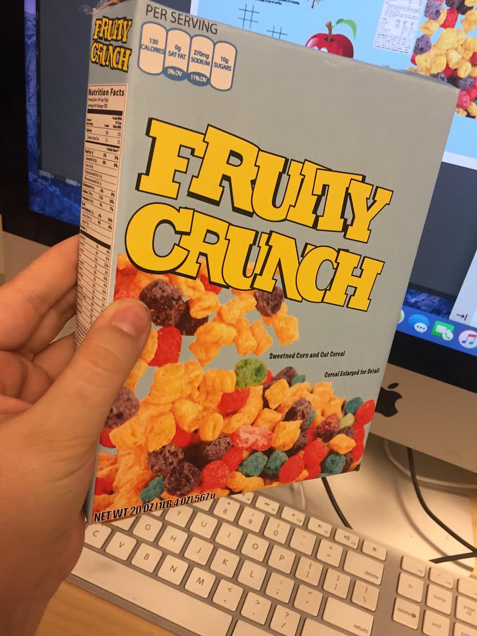
Final VersionWhen making my final version, i basically took the critiques I got and applied them to my work. For example, on the back of the box, I put a maze there which to me fits the cereal box more and looks better. To do that I had to shrink the "Did you know?" portion and move it to the side. Next, I put a recipe to fill the empty space on the right side of the box. I deleted the black lines so when printed it looks better. The only thing that made that difficult to fold it to make it exact. I also turned the label on the top of the box so when its put together it looks cohesive and everything goes together. Also on my final version I changed the color setting to CMYK for the colors in the printer to come out better. After I finished, I had to print it out and spray mount it. After I did that, I used an exacto knife to make precise lines. Then I had to fold it and put it together using hot glue. The final version of it together is displayed below.
|
|
Reflection
Overall, I think this project was a very good learning experience for graphics two students. For me during this project, I think I could've aligned things differently or make a few more minor edits. I think that since I was talkative during the working time we were given it definitely made an impact as to how much work I could get done. Although I was constantly talking with my peers around me, at the same time I was doing work. Lastly, I think that this project was a great learning point for any graphics student. At first, I was planning to do something with sports. But then as I was doing extra research to find ideas, I figured that fruit would be better and I felt better about doing it than sports. Finding an accurate template was hard for this project because of the size requirements. But once I found one, I could change the size of it to the size it was required to be. Overall, I really enjoyed this project and doing everything with this project and I hope to do more projects like this in the future. This project really brought everything I have learned in graphics one and two together to come out with this box.
