Early Versions
The image presented on the right is my first version of the parody logos. We had about two weeks of classes to complete these first versions. I got a lot of revision ideas from my class mates about how to make my project better. For the "KIND" logo, one of my class mates suggested that I make a stroke on my logo to make it more bold to illustrate a better version of the logo. Next, for the "Dell" logo, if you look very closely the first "M" doesn't really fit between the other two letters correctly. I had also made the "M" going in the wrong direction. My feedback for the "NIKE" logo was pretty good, but a classmate said that I should make the font larger and put it in italics to look more like the original logo. Moving forward, no one made suggestions for the "MLB" and "NFL" logo. Next, my first illustrator logo had a lot of suggestions. One of the suggestions was that the colors didn't really match up to one another. Additionally, my name wasn't on the correct angle and it was more curved than what it needed to be. Skipping the "Kraft" logo, and moving to the "Oreo" logo; one of the critiques I got was that the colors didn't equal each other. Also on the "E" there is a dark blue point going into the lighter blue color. Next, the logo needed just fixing here and there. The "NCAA" logo's only critique was that the circles sizes were not the same. Much alike to the "KIND" logo, the "SONY" logo only needed to be bolded more. To make these critiques, I will go through my logos and use the critiques my classmates and Mr. Boothby gave me to make my logos the best they can be. |
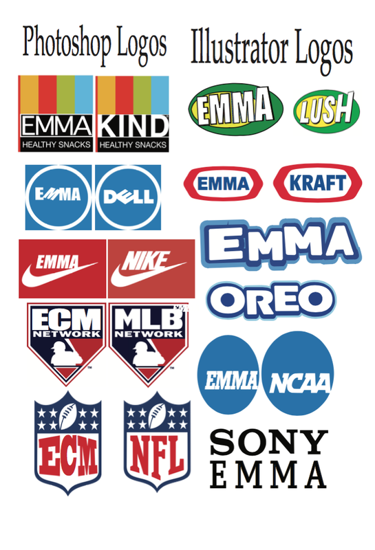
This is my first version of my parody logos project. To make the project better I will use my critiques my classmates have given me.
|
The Process
To make these logos I had to edit and revise a lot of the logos. Some of the main Illustrator tools that I used was the text tool, pen tool, and the stroke tool. The text tool helped me make the text on the logo and match the fonts exactly. The pen tool helped me make shapes to cover parts of the logo or make new parts. The stroke tool helped me make some fonts bigger and bolder so they would again look like the original. In Photoshop, some of the tools I used was free transform, stroke tool, and text tool. The free transform tool helped me get the exact size needed of the logo. Next, the stroke tool helped me a lot with the "SONY" logo because I had to make the font bigger and bolder than it was. Lastly, the text tool helped me a great deal with downloading fonts and putting them in the logo. The logo I experienced the most difficulty with was the "Oreo" logo. This is because I had trouble making different paths in pathfinder to make the background letters one shape. For the "Lush" logo, I had to make a duplicate for each letter to get the black shadow in the back. Then when I made it, I grouped the matching letters together so it would be easier to move in illustrator.
Final VersionAbove are the final versions of my parody logos. As soon as I received the critiques from my classmates, I went back into Illustrator and Photoshop to improve my logos. I think that I did I good job of fixing the logos because of the dramatic change that you can see from the first versions of the logos to these final versions. Some changes that I made from the first version to this version is for the "KIND" logo I improved the stroke because as you can see the logo has a boldface. Next, for the "DELL" logo after making the first version I realized that the angle that the "M" is on, is wrong. I fixed that so it could be as true to the original logo as possible. To fix that I rotated it until it reached this way. For the "LUSH" logo, to fix it I lowered the amount of black in the back of the white letters. I did this because when it was larger it did not
|
look well presentation wise. For the "NCAA" logo, in the first version the font was not bold enough to match the original logo. So what I did was, first put the font in bold and then put a stroke around it to match the original logo. Looking back, I don't think that I needed that extra stroke on it. Also for this same logo, in the first version it looks like it is italicized it way to much. When I revised it and made the stroke and put it in bold, it fixed this. For the "SONY" logo, in the first version you can see the logo I made was not bold enough. The stroke that needs to be around the "EMMA" portion was not present. Moving on, when revising the "OREO" logo, I changed a lot because the first version was not true to the original logo. If you look at the first version, you can see that there was no hole in the "A." To change that, with the pen tool I made a smaller triangle and put it in the middle of the "A." Then for the background, I took the outline of all the letters combined and stuck it behind the white letters. To outline the letters, it was good because then I knew that the letters would fit in perfectly. Then, I matched the colors to the original logo, so it would be the best possible. To do this, I used the eyedropper tool. I feel that this project was good to do for the graphics two class because it was almost a refresher on all the information we learned last year and showed the class some new aspects of the two programs that some people may have not known before. When I went back to critique my work I used critiques from my classmates, and teachers it mad me realize how I can fix my work and see if from someone else's point of view. Having different people look at my work helped my work and me look at my designs in a different way.
|
Reflection
I think that this project was very important to do as a Graphic Design 2 student. This project refreshed my mind on all of the graphics 1 skills that I learned last year. Not only did I refresh my mind, but this project introduced me to some new skills. By learning these new skills, I can utilize them to make my projects better. I think that for this project overall I did pretty well. At some points, I was stuck on how to complete some tasks, but once I figured it out I knew what to do. Some ways I can prevent from making any mistakes in future projects is to look over my work very carefully and make sure there is no errors. For this project specifically, I managed my time very well and got the work submitted on time and in the right place. Something I can do better next time, is to focus on my work and not talk all the time. I feel that this year in Graphic Design will be good and I will learn a lot of informing information. I think that this project taught me how to take something already made, redesign it and will be a personalized logo for me.
