|
|
IntroductionDuring this project, the class was asked to create a music poster using symbols and pictograms. Each person had to choose an artist or band and choose a certain amount of songs and represent them through symbols. The symbols have to be simple but represent a larger meaning. This project was inspired by Victor Hertz. He creates these music posters. Some famous ones he has done was The Beatles. For my project I choose Taylor Swift. I chose her because she produces a lot of songs and because of that, it gave me a large variety of choices of songs. To the left are some of Victor Hertz artwork. |
Research
- What can you note about the overall layout of the posters?
- The symbols within the poster are all in a smaller rectangle which looks very put together
- Everything is laid out to account for each song without things getting mixed up
- The artist’s name is a thick black font is the same size and the same space apart
- What words would you use to describe the symbols of each song? Are the symbols tracings? basic shapes? thick? Thin? Solid Colors? Anything else?
- The shapes of the symbols are very simple yet they portray the songs very well
- Some of the symbols are in color and some are black and white
- He evens out how many are colored and how many aren’t colored
- They are mostly all solid colors
- The bigger ones put out some sort of statement to the viewer
- What is the similarity of the sizings and spacing of each song on each layout?
- The bigger song symbols are near the edges of the inner rectangle
- It seems like also the more famous songs are the bigger symbols so it catches people's eyes
- They are all the same spaced apart from when I look at it
- Ex: The Beatles road and everything is equally spaced from the other symbols
- What font is the title of the poster written in. (you can use whatthefont.com (Links to an external site.)) or find a similar font?
- From whatthefont.com , it looks like the font used for the artist/bands name was “Veneer Clean.” by Yellow Design Studio.
- For the list of songs at the bottom and the little part above the artists/bands name it looks like that is just aerial that is italicized.
- What design and layout choices will you have to make to make your design look like one of Victor Hertz works?
- I am going to use the inner rectangle concept he did, but you cannot directly see the outline of the rectangle.
- I will also use the source thenounproject.com for some of the symbols
- I am going to use fonts to create a similar bottom presentation because to me, the viewer it looks really put together
- I will also try to balance the black and white symbols and the colored symbols like he did
Early Versions
|
This is the first version I made for the poster. I used many of the pictograms from the noun project website. For each piece of art I had to download it as an svg. Then I opened it in a new tab in illustrator. From there I could change the color and some features of each symbol. For the symbol with the fire and the person burning the photo I used the pen tool to fill in all of the space. I felt to fully represent this song I had to fill it in. After we completed this first layout, it needed to be submitted for critiques. Some of the critiques I got were...
|
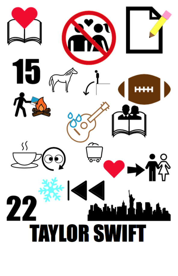
This is my first version of the pictogram music poster. Some things I can change is the layout of things.
|
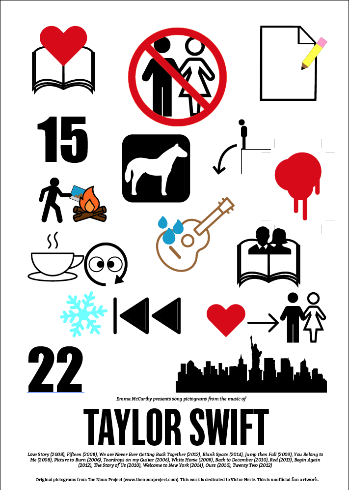
This is my final version of the Pictogram Music Poster. As you can see I added and changed many things from the first version to this version.
|
Final VersionsThe image to the left represents my final version of the Pictogram music poster. From the first version to the second, I changed a lot. I removed and added many songs. As you can see I made the white horse more noticeable. I put a black square around it which really brings out the white horse in the center. I also added the song "Red." For this the red splatter mark, I thought represented it perfectly. For appearance purposes, I filled in the drops going onto the guitar. I also took out the mine car because I felt that it wasn't appropriately showing the meaning of the song. All of the times in the poster that I represented something red, I used the same color red so it is cohesive. From the early version to this one, I changed the font because the font I used before was not as exact as it should be. Also for the final version, I changed the people so it flows better.
|
Reflection
Overall, I think that this project was very good for a Graphic Design 2 class. It taught us how use our creativity and previous graphics skills to create this poster. One thing I first struggled with was to find an artist or band with enough songs that would fulfill this projects requirements. At first Taylor Swift immediately came to my mind, but I wanted to stray away from the pop artists. But then I couldn't think of anyone else to choose, so I just decided to do Taylor Swift. She has a multitude of songs which was ideal because you needed between 12-24 songs to make this poster along the criteria. Overall, I think that I did okay on this project. I think that if I had more time to work on it and edit it, it would become more than okay. Something I could've done better was to include more songs and make the colors cohesive throughout the whole poster. I think that since I was talkative during the working time we were given it definitely made an impact as to how much work I could get done. Although I was constantly talking with my peers around me, at the same time I was doing work. Lastly, I think that this project was a great learning point for any graphics student.
