Introduction
For this project we were asked to create a throwback poster with a message that is very famous. We could choose anything we wanted to do for the poster. Personally, I choose to do the movie Finding Dory and the message "Just Keep Swimming." To find some inspiration to find any posters like this one, I went to google and typed in "Propaganda Posters" and I found a lot of interesting results. Some of my finding are below:
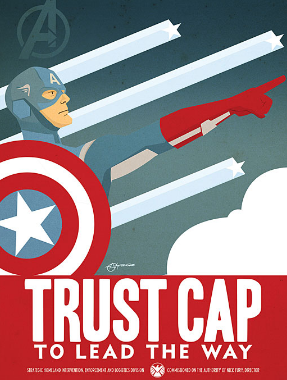
This is an example of the type of poster we are supposed to create. You can see here the designer took a popular movie and made it a throwback style poster.
|
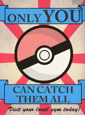
This is another example I found that is supposed to be the poster we should create. I like how they took Pokemon and even though it has been around awhile, they made it into a throwback poster. Its sort of a vintage style poster because you can see the colors and fonts that were chosen to create this poster.
|
The poster we were instructed to make needed to be 36 inches x 24 inches, resolution and 200 dots per inch. We needed to create the poster in Photoshop.
Research/Sketching
Originally, I was very confused as to what the goal for this project was. After doing some research I figured it out very fast. When I was sketching out the posters I used inspiration to create the posters. For my inspiration, I looked up Finding Nemo poster and then thought of ideas to make them into Finding Dory. Some of the examples that I was inspired by are below:
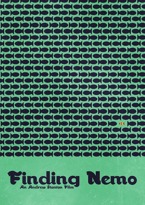
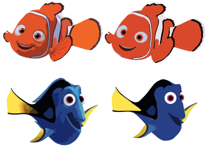
This is a Finding Nemo vintage style poster. To make it Finding Dory I would put the dory outline instead of nemo and make the colored fish going the opposite way dory instead of nemo. Additionally, for the message I would put "Just keep swimming" at the bottom of the poster near the title section.
|
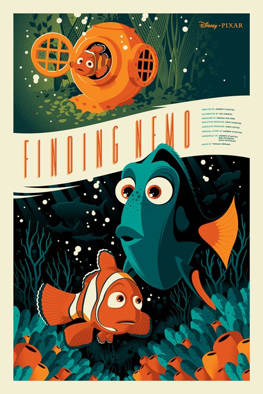
This is another Finding Nemo vintage style poster. I would kind of do the same thing they did here but make it more centered around Dory and not nemo. Or I would use some parts of this poster for inspiration for my poster. (ex: banner, bubbles, etc.)
|
For my sketches I decided to make two similar ones because I am hooked on the border will the banner sort of design. Overall I chose the design to the right. I thought this was the better of the two because the space is filled and it doesn't look empty. Also I think that incorporating Nemo in it is also important and crucial to the actual movie. The two sketches are below:
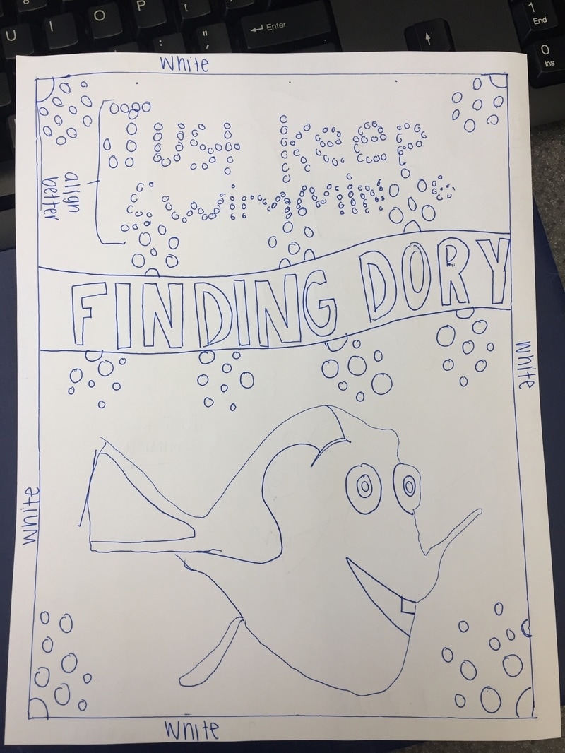
This is my first sketch. I thought it would be interesting if I spelled out "JUST KEEP SWIMMING" with bubbles because bubbles are a large part of my design.
|
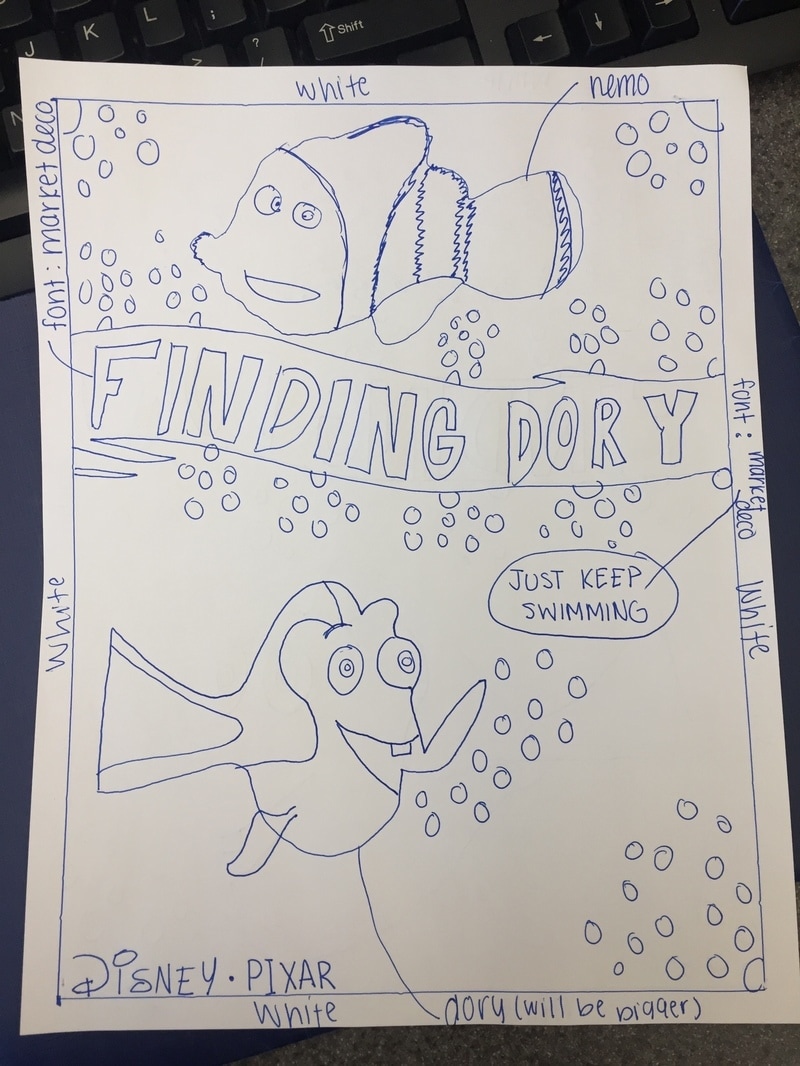
This is my second sketch. I decided to go with this one. I feel like this is the "better" of the two sketches.
|
The ProcessAfter i finished the text, I put everything together in the poster. Then when everything was together, then I could start making the bubbles. This is because I needed everything to be in place before I started putting the bubbles in. To make the bubbles I used the eclipse tool to make the circles. After I made a bunch of the circles and then positioned them the way that it looked the best. Then after I made the bubbles from Dory's mouth and then made a larger bubble with the text in it. I used the text tool, and had to use the same font (market deco) to make the "just keep swimming" message.
|
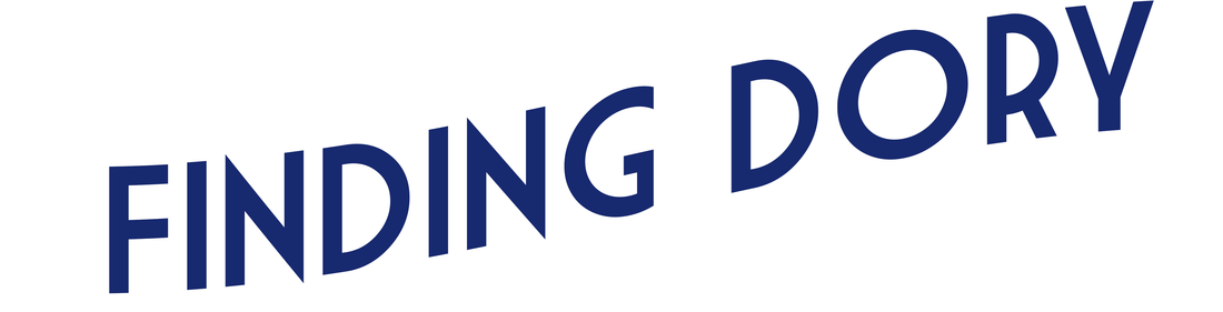
First, I needed to create the characters for the poster. I obviously did Dory. I also included Nemo because he is an essential character to the movie. To do this, using the pen tool I created many shapes to make up the character. I used many tools such as the eyedropper tool to match the colors of the characters. I simply traced the parts of the characters. Using the layers palette I could make it so it matched the original picture. I used the layers palette to stack the shapes the way they're supposed to be. After I finished, I used the characters that I made and inserted them into the poster. When originally making the poster, I made the banner that was inspired from an example that I found. Then I made an 1/2 inch border around the poster. After I finished I opened a new tab and started to create the words "Finding Dory." For the text to flow with the banner I had to download a new font. The font I downloaded is called "Market Deco." When I typed out the font it was in a straight line. To make it the way it is below, I used the "wave" effect and then changed some of the settings until it matched.
|

This is my final version of the poster. When discussing with my peers, they said the poster was good and it had the throwback feel to it, but with a modern twist.
|
Final VersionTo the left is my final version of the throwback poster. Along the way of creating this poster, some advice from my peers that I received was to change the font and look up a font. The font I downloaded and changed it to was "Market Deco." Also to make the bubbles I used the eclipse tool. Additionally, I used the pen tool to make shapes from images of Dory and Nemo that I found online. By doing this, it gave it a more vintage feel. Also I used the rectangular tool to create the border and to know that it is proportional. To get the font where it is now, I warped it and used the "flag" effect to make it flow the same as the banner. After I finished designing the poster, I inserted the "Disney/Pixar" logo at the bottom. The bubbles (to me) give it a cool look and demonstrate the setting of the movie. During the process, of creating this poster I played around with the background color. At first it was an almost navy blue. Then I decided to change it because it made a different tone and mood to the poster. When I changed it, I made it this lighter blue so it can have a lighter tone and mood. Also, I decided to use this saying because it is very popular and inspirational to many people.
|
Reflection
Overall, I think this project was a very good learning experience for graphics two students. For me during this project, I think I could've aligned things differently or make a few more minor edits. I think that since I was talkative during the working time we were given it definitely made an impact as to how much work I could get done. Although I was constantly talking with my peers around me, at the same time I was doing work. Some things that I could've done better was to make the bubble constant throughout. Also maybe my design overall could have been better. I think that maybe having the speech bubble could have been executed differently. Some things that I think that I did were good was the banner, bubbles, and characters. I think the characters came out really nice. By using the pen tool I traced a photo of Dory and Nemo I made shapes to make it look more of the vintage style. I think that this project was a really good project to do and taught me a lot of skills.
